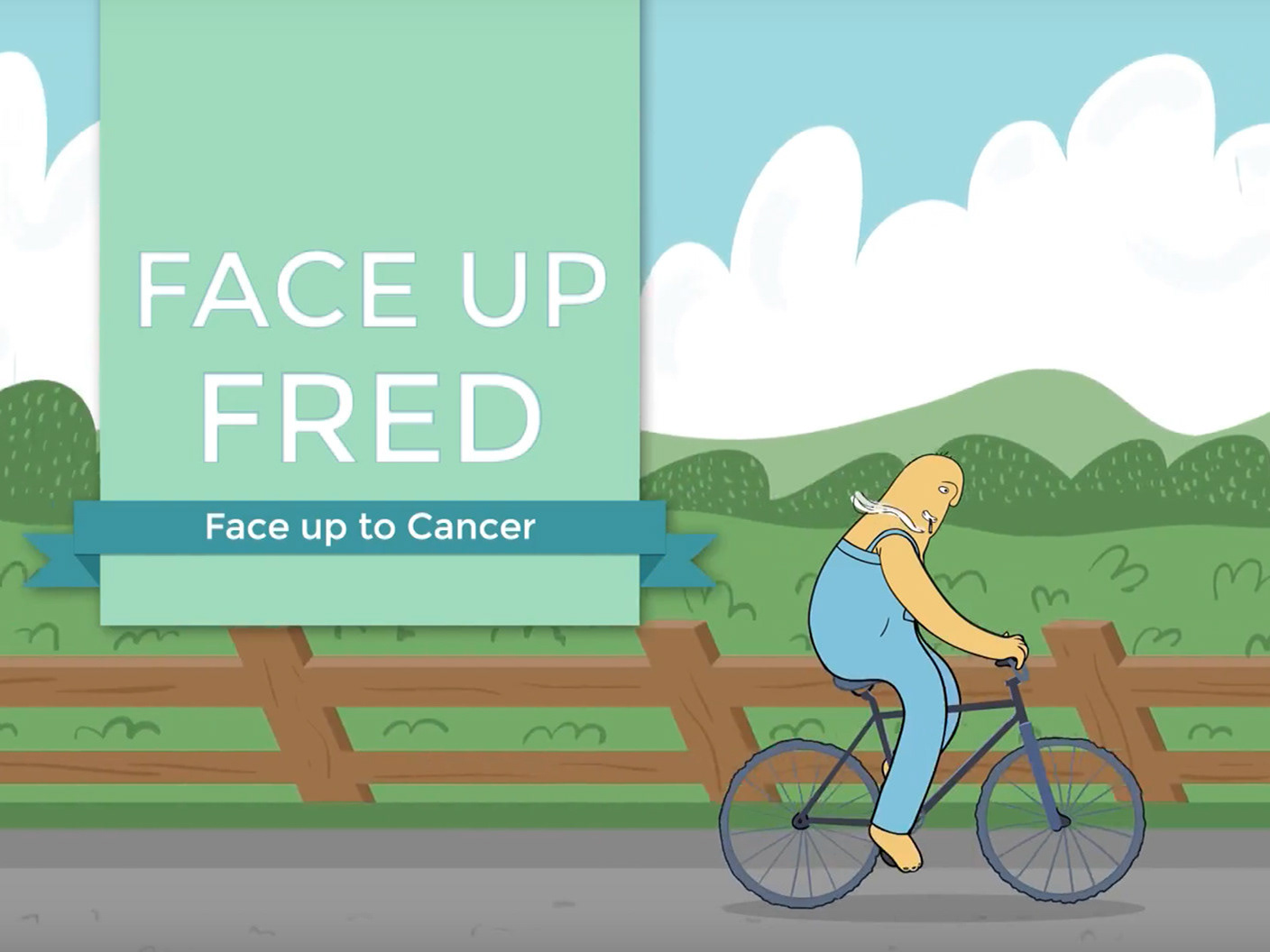


When the lovely people at Pangolin Pharmatech approached us to create an engaging video, we were excited. You might ask, why on earth would we get excited at the prospect of creating an informative animation for a pharmaceutical analytics company? That would be not only a mouthful, but also a perfectly understandable train of thought. Well, one reason for the aforementioned excitement was the brief. We were challenged to deliver an illustrated character to give a more endearing quality to what is otherwise a very data heavy topic.
his sort of thing really tickles us - giving us a license to make the boring, not so boring - and even fun from time to time. Another reason was the company's general approach of what they wanted to achieve visually, including to use their brand's refined colour scheme for the animation, with a vision to project a clean, modern vibe. All in all, a refreshing project, with a mindset that seemed in line with our own. Hurray!
We started as usual by planning the visual style. Restricting wild deviations from the Pangolin brand colour palette allowed for a more focused design method, better utilising basic form and placement in the illustrative style.
During these initial designs we played around with the idea of using mechanical items and machinery to represent the less than engaging spreadsheet process, but this was scrapped in case it could influence the perception of the company. No one wanted the possibility of the message communicated being seen as anything other than that of a pharmatech brand. We stuck to relatable iconography that was visually stimulating, but remained true to the content.
We took spreadsheets, and we made an animation about them which made them look awesome. We're thrilled with the final product, it's clean, striking, and most importantly it successfully manages to clearly communicate quite a complex message.


